Monday, March 18, 2019

Captivate 2019 Interactive Video Sample & Tips

Join us for a look at the Adobe Captivate interactive video element, new to Adobe Captivate 2019.

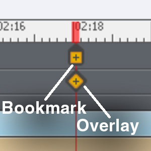
Interactive Video allows you to present a video, either from a file or YouTube, and define bookmarks and Overlay slides. You can jump to Bookmarks with Actions, while Overlays pause the video and show another slide on top.

Captivate 2019 Interactive Video Article


Captivate Interactive Video Bookmark OverlayButtons can jump to a Bookmark, whether it's on a different slide or the same one. Meanwhile, Overlays let you pause the video and show a lot of content on top of the video, if needed.

An Overlay is contained in its own slide, which is initiated by an Overlay timeline item on the main slide. Therefore, it's super easy to move an Overlay around on the timeline.

Sample Demonstration of Interactive Video


Follow the link below and view our Interactive Video demo in order to get an up-close look at these features!

Click here to view the demo.

Captivate 2019 Interactive Video Tips & Hints


When using Interactive Video, you may run into a problem we did: white flashes between Interactive Video slides. There are two things to watch out for here: Slide Transitions and background colors.

If you use, for example, a Fade transition on a slide with Interactive video, it tends to fade from white. Likewise, if either your Master Slide or Slide Color are white, it will flash white.

Of course, this can be jarring if your video has a dark background. If you still need to use a Fade transition, you'll want to make sure that:

1. The Slide Color is set similarly to your video's background. When you're on the slide with nothing more specific selected, Slide Color shows in your right Properties bar.

2. The Master Slide color is set similarly to the video background. In order to change this, go to Themes on the top. Specifically, Themes > Master Slide, then Slide Color in Properties on the right.

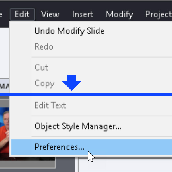
3. Finally, in Edit > Preferences > Defaults, the Background Color is set to the same color as the others.

Adobe Captivate Project Preferences

Generally, it's a good idea to set these in projects that are heavy on the Interactive Video elements. Besides transitions, you'll also see a flash of background color when jumping back to an earlier slide.

When jumping to Interactive Video Bookmarks from a different slide, they first flash a single frame from the target video. It can be a bit jarring, but we haven't yet found a workaround for it.

The frame it shows is pulled from around the middle of the video, similarly to a YouTube thumbnail. This is what Captivate uses in order to display the video when it's not loading the whole thing.

For example, it uses this frame as the thumbnail for Filmstrip view on the left.

Despite these few "gotcha"s, Interactive Video is a useful new feature that makes creating, well, interactive video, easy in Captivate!

We'd love to hear your comments, corrections, and questions in the comments below!

Tuesday, March 5, 2019

Softboxes On The Aputure LS COB 120d ii: Lighting Comparison

Recently, we did a Tech Down Over episode on some new softboxes we purchased for our studio at RELATE. Here, we'll recap what we talked about on the show, and go a little deeper into these light modifiers.

In order to get more out of our Aputure c120d and Aputure c120d ii, we got some new softboxes. These are the Aputure Light Dome Mini I and the Phottix Raja Deep 80, which we're comparing with our Aputure Light Dome I.

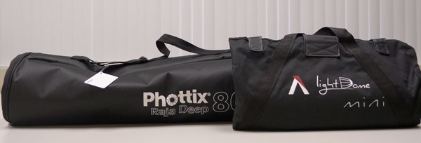
Phottix Raja & Light Dome Mini Bags
Raja Deep & Mini Dome in their carrying cases.

Note, however, that these light modifiers use the Bowens Speedring standard and will work with any light featuring that mount.

Our tests will take a look at ease of setup, how they affect the light's brightness, and then light softness.


How Easy Are These Softboxes To Set Up?


We mainly use these in our studio, therefore, we don't need to take them apart too often. If you're bringing these with you on a shoot, this could be a big factor in which you prefer, though.

However, even if we didn't take apart the Light Dome I very often, setup was our biggest gripe with it.

You need to bend the dome's 16 rods and then fit them into the corresponding slots. This takes longer than necessary, besides which the force required makes me think I'm about to break the dome!

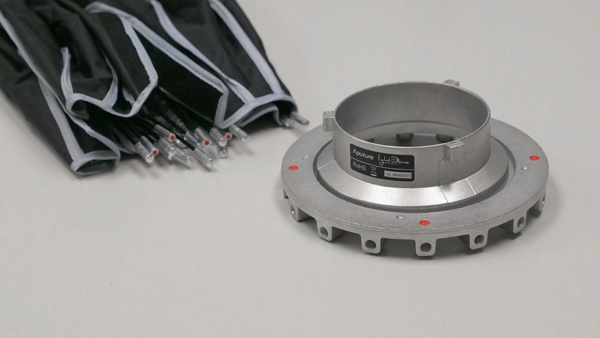
Aputure Light Dome Poles
The Light Dome I's Bowens speedring and poles.

As I understand, the Light Dome II has improved on this, but we couldn't get it at the time. This was because of an issue involving CA Proposition 65 and some of the materials in the dome.

The Mini II was also facing this issue. Therefore, we got the Light Dome Mini I and the Phottix Raja Deep 80.

The Mini I has a similar setup to the Light Dome I, but it was easier to assemble. Mostly, this was because it's a lot smaller. It's also a lot flatter, which means you have to bend the poles less to get them into the slots. Overall, I didn't feel like I was going to rip the dome or break the poles, and that's a plus!

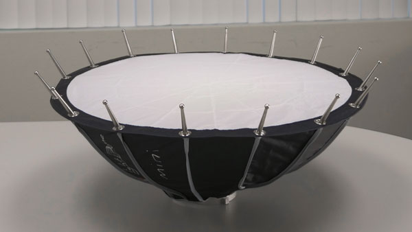
Light Dome Mini I Shape
The Light Dome Mini's shape makes for easier setup.

Finally, the Raja was extremely fast to setup. This was because it uses an umbrella-like mechanism that allows for very quick dome expansion:


As you can see, it only takes a few seconds to expand this thing.


How Does Each Softbox Affect Light Intensity?


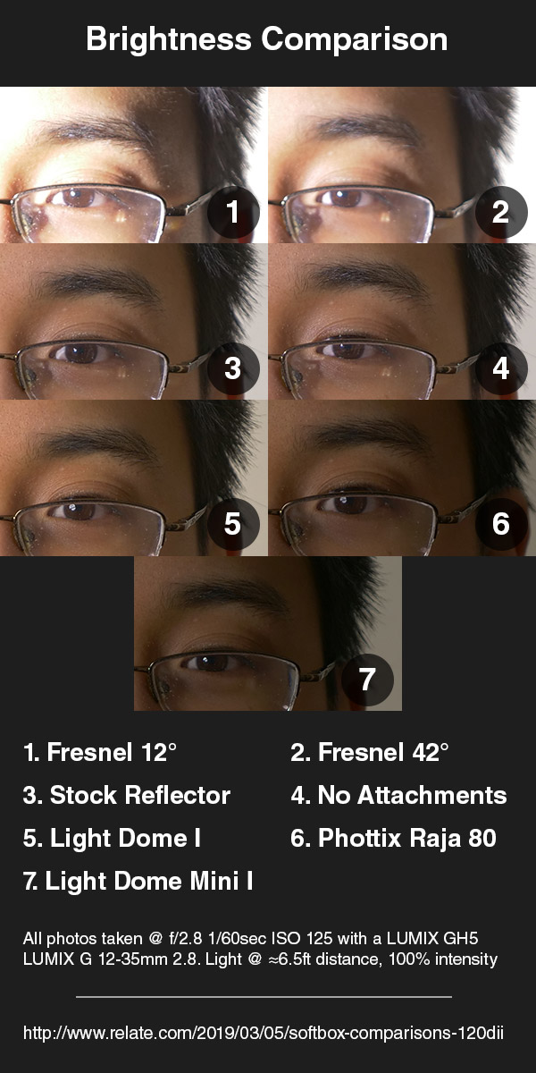
Because the diffusers and reflectors used in these softboxes aren't 100% efficient (naturally!), they reduce the light on your subject. Therefore, we've put together a comparison that should give you an idea of just how much they'll dim your light.

Aputure c120d Modifiers Brightness ComparisonThese photos are exposed for the light with no attachments at 100% brightness. Therefore, light focusers like the Fresnel lens overexpose the image, and the softboxes underexpose them.

This basically went as I expected. The Fresnel at its longest focal length created the most intense light, while the Light Dome Mini dimmed the most. This is because the Light Dome Mini spread the light so much. Out of the softboxes, the Light Dome I gave the brightest light.


How Much Does Each Softbox Soften The Light?


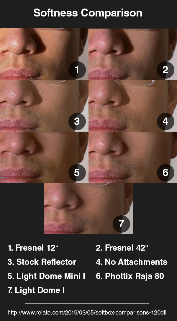
I expected the light focusing Fresnel lens to create harder shadows than the softboxes and light without attachment. This matched my tests, but the rest of the results surprised me a little.

Aputure c120d Light Modifiers Softness Comparison

When compared to the light with no attachment or the stock metal reflector, the softboxes create softer lighting.

However, the difference between these and the light without modifiers was not as much as I'd expected. I may have had the light too far from me. Still, on the larger softboxes, the front of each was only about 3 feet from my face.

With the softboxes, the shadow of my nose is noticeably softer. However, my cheek and the skin texture (which looks rougher with harder lighting) looks about the same. Also, the highlights were about the same.

While I was doing the test, the Raja seemed to offer the softest light. Reviewing these photos, though, it looks like the Light Dome I came out on top.


Which Softbox Is The Best?


In the brightness and softness tests, the Aputure Light Dome I excelled. However, the setup is a beast and a half. Further, it's more expensive than the other two, at about $150 USD.

The Light Dome II combines the poles and speedring for quicker setup, so it may be a more appealing option. But at the time of this article's writing, its availability is limited, especially in California. It also costs more, from what I understand, though none of the retailers we regularly use carry it yet.

Meanwhile, the Light Dome Mini I gives light that's almost as soft as its big brother, and is cheaper, at $100USD. The main draws, though, are the much more portable size and easier setup. It would be much more practical to try and bring this on a shoot. Still, do remember that this knocks out a lot of your light's intensity—you'll need to adjust accordingly.

Finally, the Raja casts light that is comparable to the Light Dome I at a lower price with super-simple setup. The version we bought was about $120 USD, but the setup time taking mere seconds was the biggest draw.

The version we got, the Phottix Raja Deep 80 (referring to its 80cm/31.5in overall length) is quite big. However, it comes in a lot of different sizes and shapes. It comes in both a normal (shallower) profile and the Deep, like what we bought.

Again, it lets out slightly less light than the Aputure Light Dome I, so you'll need to take that into account.

To summarize:

Price:
#1: Aputure Light Dome Mini I: $100
#2: Phottix Raja Deep 80: $120
#3: Aputure Light Dome I: $150

Ease of Setup
#1: Phottix Raja Deep 80
#2: Aputure Light Dome Mini I
#3: Aputure Light Dome I

Brightness
#1: Aputure Light Dome I
#2: Phottix Raja Deep 80
#3: Aputure Light Dome Mini I

Softness
#1: Aputure Light Dome I
#2: Phottix Raja Deep 80
#3: Aputure Light Dome Mini I

Of course, these are just the softboxes that we decided to get—they aren't direct equivalents. Still, we hope that this information helped you, whether you decided to get a certain softbox, another modifier, or none at all!

If there's another test you'd like to see us do with these, or if you have other thoughts on lighting, let us know in the comments below!

Sunday, November 4, 2018

Relate Roundup October 2018

For several months now at Relate Corporation / RelateCasts, we have been collecting all our blog articles and video podcast shows from each month into an e-mail newsletter.


However, starting now, we will instead post a monthly "Relate Roundup" blog post to showcase our latest media content.


Why the Switch?


We're switching to monthly blog posts because we want to have our monthly summaries available in a more readily-searchable form. We also would like to have more control over the format/layout than is possible with a newsletter.


If you're on our e-mail list and still prefer to be notified of new content via e-mail, don't worry! We'll still be sending out a link to the monthly Relate Roundup to our e-mail list (click here to sign up.)


So, without further ado, let's dig into the Relate Roundup October 2018! Read on to see our October summary and browse through this month's content. Or you can use the links below to jump ahead to your favorite RelateCasts series, guest, or topic:


October Summary: Captivate 2019 + Tech Reviews Galore


Joe Ganci and Rick ZanottiWe conducted interviews with 10 amazing guests on our video podcasts this month.


One of these was Joe Ganci (eLearning Joe), who visited us in Camarillo for a special in-studio episode of eLearnChat!


A hot eLearnChat topic in October was Adobe Captivate 2019, with both Joe Ganci and Dr. Pooja Jaisingh discussing/demoing the authoring tool's newest features on the show.


On our "Tech Down Over" series, in addition to our usual interview episodes, we put out a ton of bonus content. This included reviews, comparison videos, and opinion pieces on camera gear. In particular, we focused on the Panasonic GH5 and our brand-new Canon EOS-R.


Due to scheduling conflicts, we only had one Life Edge interview this month. But boy, was it a blast! We finally had our Life Edge co-host Dr. Susan Nash (virtually) meet our good friend Gina Schreck of Social KNX, and we all had a lively discussion about staying ahead on social media.


eLearnChat Videos from October


Who did we interview in October for eLearnChat, our popular eLearning interview series? Click on the thumbnail images to watch the videos:


Margie Meacham (Learningtogo)


Margie Meacham of Learningtogo spoke with us about how discoveries in neuroscience inform the development of chatbots & other applications of AI that are quickly gaining popularity in L&D.


https://youtu.be/M74j7nlETgM


Dr. Pooja Jaisingh (Adobe)


Dr. Pooja Jaisingh walks us through a demo of the two major updates in Adobe Captivate 2019: a brand new virtual reality suite & improved interactive video tools. Is Adobe's new focus on ease & efficiency of use paying off?


https://youtu.be/ZYsA5B5PnPs


Dr. Stella Lee (Paradox Learning, Inc.)


Dr. Stella Lee of Paradox Learning joins special co-host Lisa Goldstein to discuss the ethical concerns of artificial intelligence use in L&D. Dr. Lee also shares tips on getting started and thriving in eLearning consulting.


https://youtu.be/jFCWQ9nVvlY


Joe Ganci (eLearning Joe)


See our in-studio interview with Joe Ganci, President of eLearning Joe! Rick & Joe reflect on how instructional design & eLearning as a whole have evolved over time. Also, hear Joe's predictions for the future of the eLearning industry.


https://youtu.be/A-he9BQvxaQ


Ajay Pangarkar (CentralKnowledge)


Ajay Pangarkar, CEO of CentralKnowledge, joins us for an intriguing discussion with Lesley Price of Learn Appeal about the importance of understanding business and finance as a Learning and Development professional.


https://youtu.be/pBdl2BqOXko


Tech Down Over Videos from October


In October, we interviewed 4 guests, did 4 reviews, and made our voices heard with 2 opinion pieces. Click the images to watch the videos.


Emily Lowrey (Micro Four Nerds)


We talk with Emily Lowrey of Micro Four Nerds about our favorite micro four thirds cameras, including the Panasonic G9 & GH5. We also swap opinions with Emily on the newly-announced full-frame mirrorless cameras & the rigors of wedding photography.


https://youtu.be/mPugbbAygQc


Tom Antos (Tom Antos Films)


Director & cinematographer Tom Antos joins us for his 2nd TDO interview! He explains why it's best to balance your film budget over various aspects of production rather than spending it all on the latest gear & shares what he loves best about working in film.


https://youtu.be/Ulc9tcCBIfU


Pete Fox (Westcott)


Pete Fox, Westcott Technical Representative & Product Specialist, tells us all about Westcott's innovative new products, such as the company's new Cine Flex LED mats and Rapid Box line of softboxes. We also discuss the how-to's of lighting for photography and video.


https://youtu.be/6DMk9uAnRiA


Sam Seavey (The Blind Life)


We speak with Sam Seavey of The Blind Life about assistive technology and new emerging tech for the visually impaired. Rick & Sam also share their personal experiences of living with partial blindness.


https://youtu.be/-B43XkaeOs8


Are Dual Card Slots Necessary?


A lack of dual card slots for video cameras has become a common gripe among consumers. But we think, depending on your setup, you may not even need this feature.


https://youtu.be/1sLiKOZk-uQ


Canon XF405 Vs. Panasonic GH5


We compare the Canon XF405 and the Panasonic GH5! Hear our take and see for yourself the differences in focus and recording features, dynamic range, white balance, and more. We also discuss how to properly handle shooting a wide range of skin tones in the same frame.


https://youtu.be/l4H9awolcMg


Sigma 1.4 50mm & Leica Nocticron 1.2 42.5mm


We compare two lenses on our Panasonic GH5 - the Sigma f/1.4 50mm (using a Metabones adapter) and the LUMIX Leica f/1.2 42.5mm. Observe the results and see what you think - which one works better?


https://youtu.be/DX7xcZueosM


Canon EOS First Impressions


Rick & Harold do a brief demo of the Canon EOS R, the brand's new full frame mirrorless camera, and give their initial thoughts. Find out what impressed us, which features we found lacking, and try out our handy tips for efficiently using the menus!


https://youtu.be/tUJdAI_9M4M


YouTube Ad Rant


We're not fans of video ads that pop up right in the middle of a video. We argue that it's a bad practice - for viewers, for content creators, and even for advertisers. What's your take?


https://youtu.be/-xo3xgE01XU


Canon EOS-R Vs. Panasonic G9


We compare the Canon EOS R full-frame mirrorless to the Panasonic G9 micro four thirds mirrorless camera by shooting a series of photos and videos under identical conditions. You might be surprised at how close in quality the results are!


https://youtu.be/g2G3KQ7PtsU


Life Edge for October: Gina Schreck (SocialKNX)


Gina Schreck, founder and CEO of SocialKNX, a top digital marketing firm, gives her time-tested tips for rising above the crowd on social media while staying true to your company's message.


https://youtu.be/VkrSLozZ-T8


Relate Roundup October 2018: Thoughts?


That's it for our content roundup for this month! Did you enjoy the shows? Is there anything in particular that you'd like to see in a future video?


Let us know your thoughts in the comments - we'd love to see you join the conversation.


Need Help? Contact Us!


Relate Corporation is a well-established digital learning/training & media production company based in Camarillo, CA. RelateCasts is our broadcasting division.


If you need help with media production for eLearning or need any other kind of assistance with your Training & Development projects, fill out our contact form, shoot us an e-mail at connect@relate.com, or call us at 800-428-3708 to learn more about our services.

Monday, September 10, 2018

SharePoint Modern Site Design Methods

Microsoft plans to eventually phase out Classic pages for SharePoint. Therefore, familiarizing yourself with the Modern sites standard to SharePoint Online and Sharepoint Server 2019 onwards will be essential. Continue reading in order to familiarize yourself with methods to design SharePoint Modern sites.

For many desktop users, the differences may seem minimal, however, the Modern design takes a responsive approach. Because of this, the interface scales and rearranges itself for mobile users, allowing for better phone readability and access.

However, design tools are more restricted compared to with Classic sites, since responsive sites are more complex and, therefore, breakable.

If you need help with setting up SharePoint for your organization, feel free to contact us.

SharePoint Design Methods Article Banner

I'll cover two methods of redesigning your SharePoint sites. I'll also touch on CSS, and why I don't think site-wide CSS is worth using in SharePoint Modern's current state.

The first is least intrusive; therefore, if you can't enable scripts or publishing for security reasons, this is your method.


1. Change The Look


In order to change the color scheme, fonts, and background image of a SharePoint site, you can use Change The Look. This will allow you to choose from default schemes, and then make some changes.

What You'll Need


Your account will need the "Design" privilege level in order to use this tool, and that's it. Therefore, this is by far the least demanding of the three design options, in terms of permissions and site settings.

Where To Find It


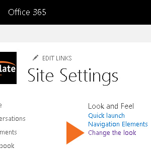
Change The Look Option Microsoft SharePoint Modern"Change The Look" is inside Site Settings, but if you're not sure where this is, look to the upper right: SharePoint Settings Menu Icon

Click this "Settings" button, and then Site Contents. Afterwards, look for Site Settings near the right side of your screen.

Now you should see lists of options, one of which will be Change The Look.

What You Can Do


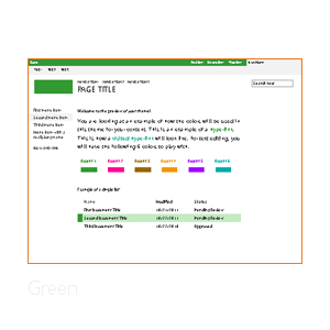
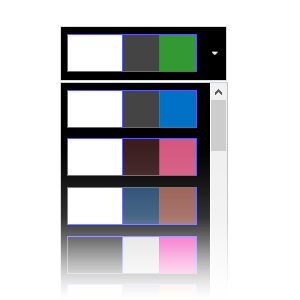
This means that you can select a theme from "Change The Look," for example, Green, but use another color scheme. You get 17 default themes and 32 color palettes.

SharePoint Green Look
SharePoint Color Palettes


In this same dialog, you can also add a background image. Note, however, that SharePoint will crop your image in sometimes unpredictable ways, therefore subtle images are preferable.

I detail how to perform these actions in the video below.


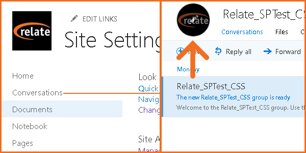
Finally, here's how to change the site's logo, essential for company branding. This is not done through a menu in the SharePoint site proper; rather, you go into Outlook through "Conversations."

Changing A SharePoint Site Logo

In "Conversations," you'll see a circle (probably with two letters) towards the upper left, above "+New." Click this, and then a dialog will appear on the right allowing you to change the image.

You'll need to be rather patient since, on SharePoint Online, it takes between 30 minutes and a day to change.


2. Custom Color Palette Tool/Composed Looks


This next method uses the Composed Looks feature. This allows you to add new Looks, therefore, custom palettes and, to an extent, Master Pages. However, custom Master Pages are not fully supported in SharePoint Modern, so in this case they should be avoided.

What You'll Need


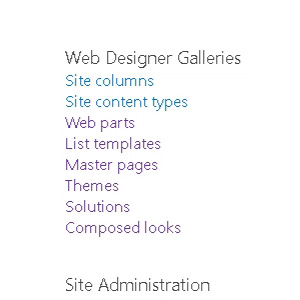
SharePoint Web Designer Galleries Settings Scripts EnabledYou'll need at least Design privileges, but a Site Collection Admin or Global Admin will need to enable custom scripts. This is a relatively simple operation using PowerShell; here are Microsoft's directions for it.

Your site administrator can also enable this through the site settings in the browser, but it takes at least 24 hours to take effect.

Afterwards, you should see a few new options in your Site Settings. Master Pages, Themes, and Composed Looks, for example, will appear.

Creating Your Composed Look


Go into Composed Looks, and then you'll see the list of default looks you could use in the first method. In order to make our own, the first thing we'll need is our own SharePoint color palette file.

You can get SharePoint Color Palette Tool 2013 on Microsoft's site.

In the video below, I'll describe how to use this tool in order to create custom palettes. Then, we'll go over how to get them into a Composed Look.


While you're following the instructions, take note that you'll need to type in URLs very carefully. With Composed Looks, you won't get error messages when there's a typo or syntax error; rather, they just won't appear.

Further, you can't edit to correct Composed Looks; you have to start over again. Hence, extra care in copying URLs and checking file directories will spare you a lot of frustration.

If you're on a Team Site, your starting directory will be https://yourcompany.sharepoint.com/sites/pagename/_catalogs/.

Meanwhile, for your main site, it will be
https://yourcompany.sharepoint.com/_catalogs/.


3. Custom CSS & Why I Don't Recommend It


In its current state, Modern SharePoint doesn't fully support sitewide CSS. Indeed, any web designer knows that this is rather unfortunate.

While you can change fonts using Composed Looks, you can't change font sizes, enlarge elements where needed, and so on. It's not impossible to implement sitewide CSS, however in most cases I would not use the currently-accepted method.

At this time, as of September 2018, SPFx is the main way of implementing custom CSS in SharePoint Modern. SPFx, or SharePoint Framework, allows you to create apps that extend SharePoint's functionality.

In order to do this, however, you'll need access to your site's app catalog. Unless you're the site owner and administrator, or you're working with a small organization, this will be a tough one.

Therefore, I say that a graphic designer is well-advised to steer clear of this one (and the wrath of IT). But if you're still willing to forge ahead, here's further reading:

SharePoint specialist Hugo Bernier's article for best practices on creating a SharePoint CSS injector: https://tahoeninjas.blog/2018/05/08/inject-custom-css-on-sharepoint-modern-pages-using-spfx-extensions/


Conclusion


SharePoint is a changing tool; certainly, Microsoft will modify or improve design functionalities in the future. Although SharePoint Classic will go away eventually, I doubt it will happen overnight, as that will affect too many organizations.

Because of this, I see Classic and Modern existing side-by-side for a long while. However, I hope this article helped to get you started on how to get your Modern sites looking like they should.

If I've left anything out, or if you have a question or correction, please let us know in the comments below!

Wednesday, September 5, 2018

Can Neuropsychology Help You Create Effective Training?

Some of the most exciting research on cognitive learning is coming from the study of Neuropsychology. For example, I've been watching a video from Peter M. Vishton, PhD in Clinical Psychology and Learning.

Some points of interest, especially for those in Learning & Development:

1. Our Brains Work Best Early: Tackle The Hard Stuff First!


Morning Sunburst Rooster Weather VaneOur brains are most active in the morning, when we have the most energy in our oxygen and glucose levels. We're more awake and ready to take on the challenges of the day... As Dr. Vishton says, we should take on the hardest tasks right from the get-go. If we wait too long, our energy reserves drop and those tasks now become much more draining on our oxygen- and glucose-starved brain later in the day...

Are Courses in Education / Training Designed Backwards?


This brings up the idea of curriculum development in most corporations, agencies and military classrooms. Are we training the most difficult subjects first or way later in the day or week, when the brain is near coma levels?

When I used to train relational database tuning and design, the course materials I had were really easy up-front. Then, as the day, or days in some classes, wore on, the material became increasingly more complex. I used to wonder why the class was so sleepy in the afternoon. Why was it so hard to bring them back to the classroom with an alert brain?

Now it makes sense to me. The curriculum was designed to do easy first and hard at the very end, when no one had any mental oomph left to give (not to mention how the poor instructor was tired too)...

In many corporations, curriculums are developed in the same manner: easy first, hard at the end. Talk about trials and tribulations! This is hard for the teachers and let's not even talk about the poor students who are on total overload in many long, multi-week curriculums.

Optimal Training Design with the Brain in Mind


It would make so much more sense to break classroom sessions into 30-60 minute pieces. Then go one-on-one, into labs, more breaks, etc. before returning to the classroom. In fact, the longer the day, the more breaks should be given. I can verify from classes I've taught that more breaks later in the day are not only welcome but necessary...

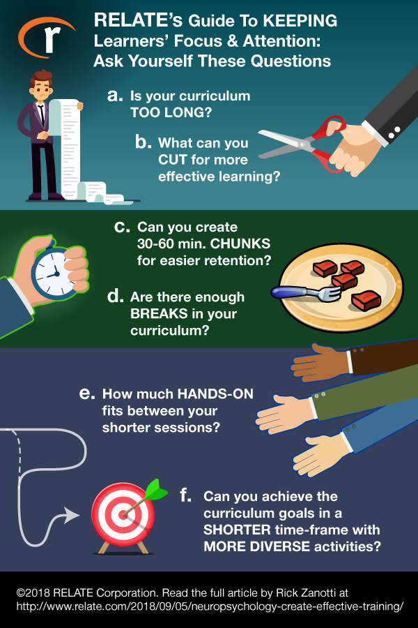
Have you looked at your curriculum lately? Ask yourself these questions:

a. Is the curriculum too long?

b. How can you shorten the curriculum to make it more effective?

c. Can the courses/lessons be chunked into more bite-sized pieces for easier digestion by the brain?

d. Are there enough breaks given throughout the day to ensure brain activity at the end of that same day (remember, they have to drive home usually, alert!)

e. How much hands-on can be done between shorter lecture sessions?

f. Can the curriculum goals be achieved in a much shorter time-frame with more diverse classes (i.e. diverse activities, things to do)

There are many more questions you can ask but this is a good start. You can use the graphical guide below to keep these prompts handy as you design/refine your curriculums:

Keep Learners Attention Effective Training Infographic

For more discussion on how to develop more attention-grabbing courses, you can also read my article on design mistakes that make eLearning boring.

2. Neuropsychology Findings on Memory & Gaming


Dr. Vishton also commented on memory and gaming... Whoa, wait!!! Nothing could be wrong with gaming now, could there be?

It turns out that gaming, especially when playing more repetitive, arcade-like games, definitely affects short-term memory in adverse (and sometimes positive) ways.

Can Gaming Worsen Memory by Dulling Emotion?


As I've discussed before, emotions play a leading role in learning. And playing games can reduce the emotional intensity of your life experiences, for better or for worse.

For example, if you go on a first date and feel incredibly happy after a first kiss, going home and playing Tetris, or some other similar game, could erase most of the impact of that first kiss or date.

It deadens the emotions, and the more engaged with the game you are, the more you will forget or deaden that emotion. You could even forget large parts of your recent experiences or the emotional impact those moments had...

Erasing Thoughts Memories on Blackboard

On the other hand, you're driving home and see a car crash with a person on the ground covered in blood, dying... Uggh, not a good memory at all! And yet, if you go home and play Tetris to forget the emotional trauma of what you just saw, the impact of the crash scene will diminish incredibly.

The end conclusion is that gaming screws our minds over when it comes to memory, good or bad. From studies I've done years ago what happens is that brain grooves and goes into loops. Less connections are made and the person in that groove is less capable with language and cognitive skills. Games can literally addict gamers' brains and make them highly unproductive. Not all people will react that way, but many will...

Does Gaming Really Impact Classroom Learning?


If your students are in a full day class then go home and play hours of a game, much of what was learned in the class could be diminished. If you don't believe that, just look at the randomicity of answers provided by students everywhere nowadays... It's kinda scary and corporations spend a lot of money training people who routinely un-train themselves...

Remember, gaming appeals to pleasure centers in the brain and less to areas like the frontal lobes where the executive functions lie...Pleasure and impulsivity tend to go hand in hand...

Conclusions: Analyze Your Training with Neuropsychology


I've already covered some conclusions about the two examples given. There are so many other ways to look at training if we look at it from a neuropsychological standpoint. This area of Psychology can be more easily quantified scientifically, unlike the more complex psycho-emotional sub-disciplines.

The best thing to do is to analyze the training as it stands in your organization. Break it into more pieces, smaller ones at that, and put them back together into a different order. Maximizing some of the principles we talked about could make a huge difference in how we learn and how we produce.

Please leave some of your ideas and comments below and let's start a conversation. Thanks!

Having Trouble with Course Design?


Also, if you need more advice on course design or any other assistance on your Training & Development projects, we're here to help. Give us a call at 1-800-428-3708, send us an e-mail at connect@relate.com, or fill out our contact form to learn more about what we can do for you.

Friday, August 17, 2018

"Mics for eLearning" Microphone Reviews

Hi Everyone!


I get a lot of e-mails from people wanting to know about this microphone or that one. There are a wide selection of choices out there and when you're looking to buy a new mic for eLearning voice-over, it can be tough to discern which one would serve your needs best.


Lack of Microphone Reviews for Voice Over


There are tons of mic reviews available on YouTube. But the vast majority of them are targeted to singers and musicians. Reviews specifically for voice-over applications are few and far between in comparison.


Also, unfortunately, many YouTube mic reviews are performed by people who seem to know little or nothing about audio production, causing even some of the best mics out there to sound awful, due to poor vocal technique or a bad setup.


Now I can understand why so many people are having trouble finding an appropriate mic for voice-over — with the over-saturation of reviews and conflicting opinions out there, the process can be downright confusing!


Naturally, We Started Our Own Series!


So, several months ago, we came up with a new series for our eLearnChat show highlighting a variety of mics that are great for eLearning.


In each "Mics for eLearning" review, we:


  • Demonstrate mics with the same voice & under the same studio conditions

  • Go through our list of pros, cons, & suitable applications for the mic

  • Discuss pricing & link to the specific model tested


The playlist on YouTube can be found here:


The videos play in sequence starting with the first review in the playlist. If you'd like to skip forward to a particular mic review, click the drop-down menu in the top left of the embedded player.


As we get new mics, we'll add those to the list in order to keep you up-to-date on the growing selection of good professional mics.


Don't Skimp on Audio Equipment!


NOTE: Though I realize that everyone wants to save money, we are not focusing on the cheap mics which frankly don't sound all that good. Audio quality is important and we want you to have great audio to make your courses engaging and retentive.


Honestly, if you think about it, it's a worthwhile investment. You just can't get the clean, professional sound crucial to eLearning voice-over from a mic that costs less than $100 USD or so.


After all, it's much better to save up to purchase a decent mic that you can actually use with pride than to risk getting stuck with a junker. Why settle for a cheap mic that could harm your reputation with your clients/audience?


What Microphone Brands Are Best?


There are a number of reputable brands that are known for one or several great mics. Here are some mic/audio brands we've reviewed or plan to review:


In the end, the "best" mic for you simply depends on what you plan to use the mic for and how you'd like your voice to sound.


For example, consider someone looking to do a lot of small live seminars. The speaker will need to walk around freely. Also, in a confined space, there's no need for over-the-top amplification. So, an over-the-ear mic with a personal, intimate sound, like the Countryman E6, would be perfect.


On the other hand, a podcaster recording in a studio with a preference for a grittier, more commanding AM radio-like sound might enjoy using the Electro-Voice RE27N/D


Thus, you'll have to think carefully about your needs and let that guide you to your final decision as you watch our reviews.


Need Help with Audio Production?


We're doing our best to include a variety of price ranges and applications in addition to voice-over for eLearning in our microphone reviews. We hope you find the series helpful.


If you have any questions please ask them in the videos or place a comment in the comments area below.


And if you're having trouble with audio production for eLearning or need any other kind of assistance with your Training & Development projects, don't be shy to call us at 1-800-428-3708, send us an e-mail at connect@relate.com, or fill out our contact form. Thanks!

Wednesday, August 8, 2018

Easy Paginated Course Content in iSpring 9 Visuals

iSpring Interactions IconToo much text overwhelms your learners, so today we'll see how iSpring 9 Visuals lets you organize and paginate content.

Certainly, a lot of new ways to do that are available in iSpring Suite 9, using the Visuals editor.

In essence, the Interactions you create in iSpring Visuals can be organized like mini websites. This allows you to include a lot of content that is not only familiar in format, but varied and interesting.

If you're interested in iSpring 9 and its features, we've also done articles on TalkMaster and Cam Pro.

You can either keep reading, or skip ahead to later sections with these links:

Why Use Paginated Content?
How Easy Are Visuals Pages To Make?
Text Editing
How Does Paginated Content Appear In Courses?
Concluding Thoughts


Why Use Paginated Content?

iSpring Visuals Tabs Demo Gif

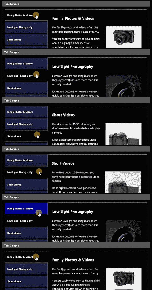
With iSpring's visuals options such as Tabs, Accordion, Catalogue, Media Catalog, you can fit a lot on a single slide. For eLearning courses, you'll often have a lot of content to fit on each slide, but little space for it.

Check out our demo of iSpring Visuals in order to see some of these features in action.

Therefore, we often struggle to fit everything without boring our learners with big, lifeless blocks of text. Generally, things like pop-ups, fading-in content, and animations help break the monotony.

iSpring Visuals doesn't necessarily replace those, but rather, it adds a lot of easy-to-use options. Thus, with minimal effort, you can create a nice-looking course with plenty of variety.
iSpring Visuals New Interaction Screen

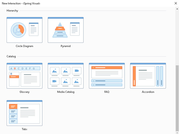
And when I say a lot of options, I mean it. There are 13 iSpring Visuals options at this article's writing and, last I heard, even more are coming.

However, I'll only touch on some of the simpler ones here, including Tabs, Glossary, and Accordion. Rather than going over all of the types in detail, we'll go over some general features.


How Easy Are Visuals Pages To Make?


When you click on the Interaction button, the active slide creates an Interaction object, and the Visuals editor opens. This also creates a corresponding ".visuals" file which contains all of the data for that Interactions object.

You can, therefore, import Visuals slides into other PowerPoint files, if needed. In order to make several similar Visuals slides, you can copy the file and import a copy to another slide.

Once the Interaction object is on your slide, it will look like this, with a small preview of your Interaction.
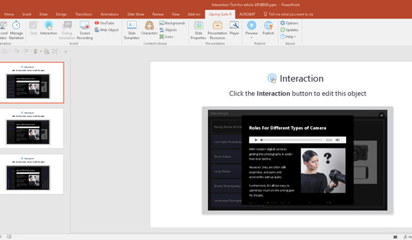
iSpring Interaction Slide

The actual Visuals editor is easy to learn if you know PowerPoint, because the controls use a similar layout. On the left side, rather than slides, you have whatever subpage type applies to the specific Interaction you're using.

Each Interaction type has its own subpage type, but it's nonetheless intuitive; the button is always in the same place.
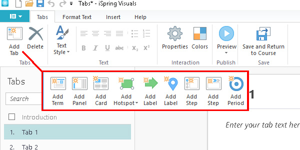
iSpring Visuals Different Subpage Types

Once you've chosen your Interaction Type, it's quite simple to start adding tabs, panels, hotspots, and get started! So, let's take a look at how you build these subpages.


Text Editing
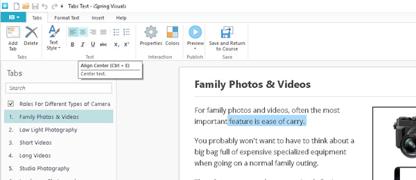

Screencap Text Editing Tabs

Above, you can see the text editing interface, which works similarly to something like Microsoft Word. Rather than text boxes which you can move around freely like in PowerPoint, the content automatically aligns and wraps.
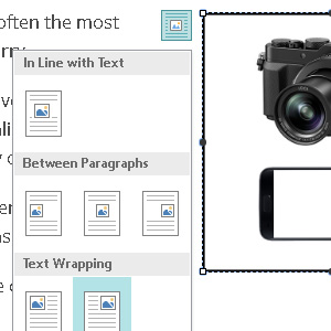
Screencap Text Wrapping Options In VisualsTherefore, inserting images is also similar to Word, where you can align images with paragraphs, selecting how they wrap.

This may be somewhat restrictive, but it's for a good reason; making these pages is very fast and streamlined.

Standard text formatting options are available, such as paragraph alignments and justification, as well as customizable default text styles. Specifically, with the latter, you can set font, size, and use of bold or italic in four different styles.

These styles determine the subpage's title, that is, Item Title, two types of heading, and normal body text.

However, note that these are unique to each Visuals file, not each course or PowerPoint file. In order to re-use styles, you'll need to make a copy of the Visuals file to use as a template.


How Does Paginated Content Appear In Courses?


When you're making an eLearning course, it already has pages and, most likely, plenty of them! Therefore, you may be wondering, "how does pagination within pagination work—won't it be confusing?"

Inside the published course, the main "Next" and "Previous" buttons operate both main slides and subpages of Interaction slides. Therefore, it can work quite seamlessly, eliminating the risk of readers clicking the wrong button.

However, you can change navigation options in the main iSpring PowerPoint plugin. In order to do this, you need to go to the "Player" options on the ribbon.

Screencap Player Icon

Here, in case you need learners to easily access other course pages, you can enable Outline navigation. This allows movement from one slide to any other at any time, unless a restriction is present.

Of course, you'll need such a restriction for most courses, as you won't want users intentionally or accidentally skipping content. In order to do this, you can change navigation options in the aforementioned Player window.
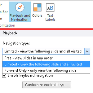
Screencap Playback Navigation OptionsBy default, iSpring will add an Outline sidebar to your course, which then allows users to go to any page. However, you have the option to prevent them from accessing pages in the Outline which they haven't visited.

You can see an example of the Outline feature in the demo included in this article.

Access these with the "Playback and Navigation" button, where you can then change the navigation type. This will affect both the Outline feature and the main Next and Back buttons.


Concluding Thoughts


Firstly, for more info on this handy tool and details about its features, check out the in-depth webinar by iSpring themselves!

iSpring Visuals is, similarly to many of the Suite's features, an effort to make interesting and varied content accessible. eLearning pieces are oftentimes a dull affair, as we all know, but not without reason.

Making a course stimulating and interesting to look at takes time, resources, and people, more than many training departments have. Therefore, generously-featured authoring tools like iSpring which emphasize ease and efficiency of use are a potential godsend.

All in all, iSpring Suite is a ambitious and rapidly-growing authoring tool. We at RELATE are quite interested to see where it will go next.

In order to read about other features of the Suite, visit our iSpring articles category. Otherwise, check out the official site.